Add a Visual to a Company Single Tool Report
Objective
To add a visual to a single tool report.
Background
Make your report's data easier to interpret at a glance by adding a visual. You can create various charts, such as bar or line graphs, to highlight key trends, proportions, and comparisons.
Things to Consider
- Required User Permissions: To add a visual, you need permission for both the 360 Reporting tool and the report's data source.
- 360 Reporting Tool: 'Standard' level permissions or higher.
- Data Source: Varies by Procore tool (e.g., 'Admin' for Directory, 'Standard' for Financial Management, 'Read Only' for Project Management).
- Additional Information:
- Data Size: The 'Add Visual' option is only available for reports with fewer than 2,500 records. See Why is the Add Visual button unavailable on a single tool report?
- Cloned Reports: To modify a visual on a copied report, you must be the person who created the copy. See Copy a Company Single Tool Report.
- One Visual Per Tab: You can add only one visual to each tab.
Steps
- Navigate to the Company 360 Reporting tool.
- In the Reports tab, locate the desired report.
- Click the report to open it.
- Click + Add Visual.
- Enter a name for your new visual in the Descriptive Title box.
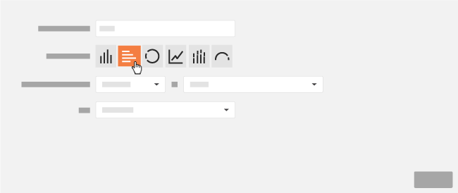
- Next to Type of Visual, click the desired button to specify which visual to create.
Note: Depending on the visual, you will have the ability to select different measures on which the report's calculations can be made.Chart Type Best Use Case Available Measures Bar Comparing values across different categories or discrete time periods. COUNT, SUM, AVG, MIN, MAX Donut Displaying the relative proportions or percentage breakdown of a whole. COUNT, SUM Line Showing continuous trends and changes over a period of time. COUNT, SUM, AVG, MIN, MAX Stacked Bar Comparing categories while also showing the composition (part-to-whole) of each category. COUNT, SUM, AVG, MIN, MAX Horizontal Bar Comparing categories, especially useful when the category labels are long. COUNT, SUM, AVG, MIN, MAX Gauge Visualizing a single value against a set threshold to indicate performance (e.g., good, poor). COUNT - Click Save.
- Optional: If you want export your report with your new visual, click Export and select PDF with Visuals.